Pages
▼
Friday, December 21
I Totally Forgot About My DIY Greeting Card Series
Back when I was first setting up Real Wisconsin News, I had this idea to use a photo of my friend in various settings to help promote the site. That turned into the idea that I could make an entire line of greeting cards with him as the messenger. The main problem was that I didn't have the digital photos to edit (this is back in 2005 or so), and I really didn't have a way to market the idea. So I just stuck "Homeless John" in several photos that I did have in digital format. One day, I'll add him to more of the 30,000 photos I have. For now, I'll just go through the process I used, if I can remember it.
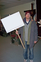
It starts with a classic photo of John holding the sign for Dan's wedding. He's in the church, and I snapped the picture before he headed out to stick the sign in the ground somewhere. This was necessary because the church was really a storefront in a mini-mall, and Dan figured people would end up at Radio Shack asking for directions. It was cold outside, so John was bundled up in his layers. I remember when I first saw the photo, it almost looked like someone had doctored the text of the sign, but it also looked so easy to do: a white background that anything could be added to.
So that's what I did first, just using the eraser tool to get rid of the original writing. That's easy enough in most programs. I was using Photoshop or GIMP, both of which can accomplish the rest of this non-tutorial. I started by erasing the original text with white, but if you have another color, then you might need to paint after using the color selection tool. I've found that most photos don't have a consistent color, even if the item (sign) is actually all white. I was fairly lucky with this one that the white mostly matched.
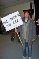
I played around with writing clever quips about weddings or churches after deleting the original message, but it really wasn't enough entertainment for me. Here's the one photo I saved when I just changed the message on the sign.
I needed to free John to do more, which meant I needed to use the lasso tool to select him so that I could paste him in a new place. There's probably a different way in photo editing software to do this, and a decade later, maybe it's more automatic, but it was fairly painstaking and frustrating.
Once I was able to select John, then I could paste him as a new image. I just erased all the words on the sign, selected the parts I wanted, and cut it out. Or, maybe I deleted the background. Again, this isn't a tutorial. I do know that if you want to save it with a clear background so you can make an overlay, it has to be in a photo format that allows clear backgrounds. I think I use PNGs for this. The white, as seen here, should look like checkerboard when in an editing program. But not the sign...the sign has to be actual white, or else it would be see-through.
I started with a message about my new website, and I used this one on my business cards that I printed up. Strange, yes, but it was a satire website, so I figured strange was cool.
Adding text to the sign can be time-consuming. You have to find a font that fits, can be read, and looks relatively hand-written. Then you have to rotate it. As you can see in this one, it's a bit under-rotated. Then again, most right-handed people trail off in their writing, and making it look too perfect might draw suspicion from those who like to find hoaxes.
Once you have your original with clear backgrounds, you can paste John wherever you want. You can see in this early attempt that I had not erased the area near John's arm to be clear. It was white, which meant it wasn't going to look great. You probably have to use the free selection too and delete it. Color to Alpha, which is good in GIMP, can work for something like a green screen (in case you have one in your home studio), but that tool will take too much out of a normal photo, and make the sign clear if I chose white.
Anyhow, I got it done, and then I had my saved image of John and the sign. Each new image would require me to edit the sign and then paste him in as a layer on the new background.
I had some ideas for complete cards, like the one about the meeting. I don't know where those full greeting cards have gone. But I also just stuck John in other images. Oh yeah, it can help to adjust the colors of John before he goes into the photo, but I'm not sure I bothered to do much with that. You do have to stick him in the right place relative to other people in the photo, or else he'll look too big or too small.
I'll add a bunch to the bottom of the article so that you can fully enjoy the project. I use some of the skills from this project in my website design, especially for favicons or header images, where you might want clear backgrounds instead of white on a color background.
Fin
Thanks for reading. See more of my content:
Satisfamily - Articles about being happy as a family
Passive Ninja - Web Design in Jacksonville
McNewsy - Creative Writing
Educabana - Educational Resources
Brave New Church - Church Website Design
Voucher School - Pros and Cons of School Vouchers
Luthernet - Web Design for Lutheran Churches
Sitcom Life Lessons - What we've learned from sitcoms
Mancrush Fanclub - Why not?
Epic Folktale - Stories of the unknown
Wild West Allis - Every story ever told about one place
Educabana on Teachers Pay Teachers (mostly ELA lessons)
Real Wisconsin News - Satire from Wisconsin
Zoo Interchange Milwaukee - Community website
Chromebook Covers - Reviews and opinions
Brian Jaeger - Resume (I'm always interested)
Contact Me


